Wednesday, June 1, 2011
Cyberpunk Visuals
How many of you have seen cyberpunk or cyberspace visuals in one form or another? A lot of you huh? Well, as a techno-geek, I'm here to over-analyze it for you. Let's say you want to have cyberspace in your game, or maybe you want to add that extra cyberpunk touch to the visuals. Maybe you just want a new desktop background. Whatever the case, I love this subject, so it should be fun to read. ;)
There are basically three kinds of cyberpunk visuals. The first, are cyberspace visuals. You have glowing things on top of black or near black, probably lots of other glowy things flying around. You can throw in some 0's and 1's for good measure, and maybe some assembler language. You can have big glowing towers, grids, circuit-board designs, or whatever else you want.
Some examples of cyberspace visuals:
Then you have urban visuals. These are basically demonstrations of industrialization, dystopian societies, and a post apocalyptic world. Common themes include Night time cities, places that look like they've been bombed out a hundred times over, huge buildings, and dark alley style places of the underworld.
Examples:
Even after urban visuals, you have cyborg visuals. These are here to express the ideas behind the combination of man and technology more directly. Cybernetic implants, people with wires hanging out of their heads, androids, and others are prominent here.
Examples:
Cyberpunk visuals aren't extremely strict however. They also seem to range from doing nothing but communicating ideas to being there only for the visual appeal. All in all, it's not that hard of a style to recreate. Naturally, cyberspace visuals are the easiest, as they contain no real world objects. Urban visuals are usually in the middle, needing a lot to be done, but not necessarily in extremely high detail. And cyborg visuals tend to be the hardest, especially if they are CG and even more so in real time. This is because of the huge amount of detail required.
I can even crank out some cyberspace visuals right now...
.
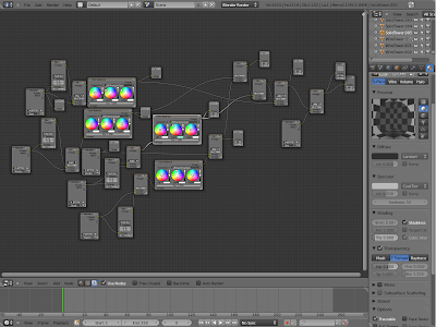
That took less than an hour. It was pretty simple really. I used gimp to draw me up a long string of zeros and ones, then slapped them onto a bunch of transparent flat quads. After that I took the schematic's I'd drawn up earlier and stuck them on a floor plain. I threw in some solid wireframe towers and a solid wireframe monkeyhead, and then was ready for post-processing effects. That was actually the hardest part, and if you don't believe me, then take a look at my composite network in blender:
See what I'm saying?
Anyway, duplicating cyberpunk visuals isn't that hard, and can be really fun. That said, if you're having trouble doing cyberpunk visuals, you can always start by trying to duplicate another cyberpunk scene. This way you'll learn a lot about how cyberpunk visuals work while getting ideas for things to use in your own creation.
As I implied, cyberpunk visuals are fairly loose. There isn't some set of rules that I check a scene with to decide whether or not it's cyberpunky. To quote cyberpunkreview about what loosely describes cyberpunk:
"Cyberpunk is about expressing (often dark) ideas about human nature, technology and their respective combination in the near future."
This is basically the same for cyberpunk visuals. Cyberpunk visuals are simply visual expressions of cyberpunk ideas.
Hm, I like that picture I made. I think it will be my new desktop background for awhile.
--LazerBlade
Subscribe to:
Post Comments (Atom)


No comments:
Post a Comment